This post is part of the Designing a New Old Home series, but can be read separately, without needing to read the other parts.
Designing a New Old Home series, Table of Contents
Beginnings — Why an “old” home, and how we came to buy land
Curiosity — Advice on starting
Research, Sketch, Collect — Essential research for home design
Defining Constraints — What can we do without
The Elements — Heating and cooling and airflow
Materials and Hardware ← You are here
The Kitchen
…
Materials and Hardware
After your floorplan, and along with your use of sunlight, the materials you choose will make the biggest difference in the mood that inhabits your home. New houses are made of drywall, carpet, polyurethane (plastic) coated wood floors or now entirely synthetic “wood” floors, foam doors, chrome and plastic hardware, and typically large, inexpensive tile that often looks the same house-to-house. Old homes tend to have a lot more plaster, oiled wood, smaller tile, heavy solid wood doors, and very varied hardware, tile, wallpaper, colors(!), more brass and iron, rugs instead of carpet, and no plastic. I am not suggesting you build your own home in any particular way, but it may be useful to think about these things. This post covers our own thinking and what we decided.
Before you start, keep your end goal in mind

This is not too obvious to say: your house should be built out of the things that you’d like to see in your house. The walls and surfaces and the things on them should feel like they go together. The things you use every day should feel like they belong. What makes some houses look very appealing and others uncanny is the level of coherence and honesty in the surroundings.
It is difficult to create a house that feels in some sense truly beautiful if the house itself is made out of cheap or unfitting materials. So as I mentioned in the second post, our goal is a few good details in the right places.
What’s the matter with modern choices?
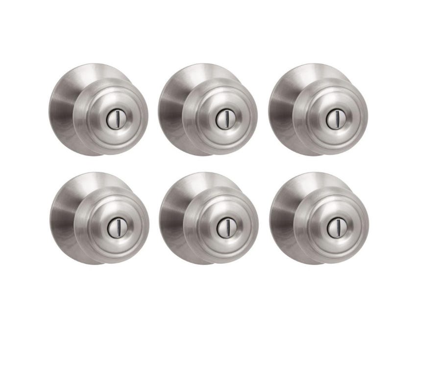
Aside from the obvious cost motivation, there seems to be an aesthetic undercurrent in new home construction. I think it is wrapped up in the design trend towards “cleaner” spaces. This trend spans centuries, though in America it is most obvious between the transition from Victorian and Eastlake houses to the modern houses we live in. Consider, for example, some popular doorknobs today:
I hate these knobs. You can feel it when you turn them, they exude carelessness. They are “clean”, they make no aesthetic promises that you have to keep with your own decor or the rest of the house. But they aren’t born out of a respect for minimalism, they are just part of the rabid economizing on all house parts that do not directly contribute to square footage. In a $500,000 house, the builder spends maybe $200–500 total on doorknobs, including entry knobs. I think this is a mistake, and maybe the first signal that no care has gone into the design.
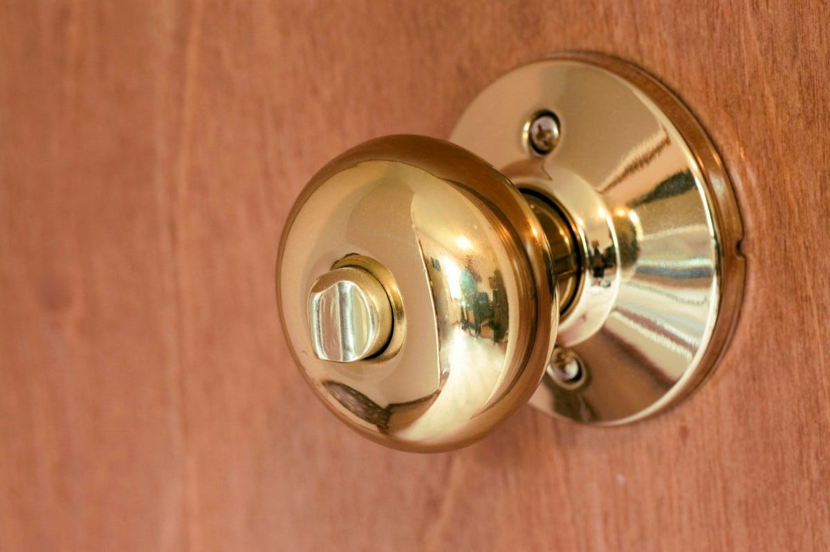
For our knobs, we bought old hardware at architectural salvage stores, eBay, and yard sales. Some were in poor condition and needed some fixup, but that’s (hopefully) some one-time work. Many of our knobs are in the Eastlake or similar style:

One important thing to note, if you go this route and buy old hardware, is that you must order doors that are not pre-drilled. The bore hole of modern doorknobs is much larger than the small vintage rosettes and plates that are screwed to the door to hold the knob and spindle. If you don’t buy pre-drilled doors, you will also have to have a carpenter bore your doors for the spindles and latching mechanisms, which will increase your cost.
More simply, you can just buy nicer knobs that fit modern doors. Many brands sell them, such as Emtek (sold on lots of sites including large ones like build.com), House of Antique Hardware (which re-sells a lot of brands, including Emtek), and many other places online. Nice sets can be fancy, like the Eastlake style, or fluted glass, but they can also be simple brass, iron, or porcelain knobs that were common one hundred years ago. Buying attractive modern-door knobs cost about $50–200 per set. You are free to mix these and cheaper knobs, and for many of them you can put a nice knob on one side (like the doorknob for entering the basement, that guests would see) and a less expensive knob on the other (the doorknob you see if you’re in the basement), and by splitting up the “nice” pair, use it in two places. Note that it may not be possible to mix and match all modern brands like this, but with antique hardware it’s often easy.
How much you spend on something like knobs is up to you, but my feeling is that the hardware you physically interact with, the things you are actually touch every day as you go about using your house, are worth the extra cost. They should be heavy and feel like solid, purposeful objects, and not a hollow piece of brass connected to a hollow door.
Speaking of doors: Try not to buy the cheapest ones! You don’t have to get solid wood doors to have them feel considerably better (heavier), you can get MDF doors inexpensively that are fairly heavy and feel OK. When looking at options, pay attention to the weight of the product. See them in person if possible.
What’s really going on here, with beautiful door knobs?
The doors of different ages tell a story, but it is a very common story, not at all about door hardware. Door handles were once simple pieces of wood or iron, shaped into bars or balls. As time went on hardware became more ornate, and there are many pretty examples of latches and knobs not just in museums but also on medieval shops and churches that still exist today. With the industrial revolution it became even easier to create more beautiful and complex designs, like the Eastlake ones and other styles.
But some time in the age of mechanization we seem to have stopped caring. The average knob with a lock has a fair amount of internal complexity, but the beauty has been completely stripped out. We no longer think of knobs, hinges, latches, or locks as things worth making beautiful, and we think this at a time when it should be easier and cheaper than ever to make such things beautiful. When they were difficult to make, iron latches and handles resembled hands, lions, flowers, gargoyles, etc. Now that a latch is easy to make, they look like nothing. This is worth pondering, I think, beyond the words of this post and well beyond door knobs.
With all the advantages of technology, we rarely build beautiful everyday structures or everyday objects. All the progress in mechanization and materials seems to be little match for the colossal bad taste that permeates environments. This seems to me a kind of primal mistake. Where the divine may exist in history, we read of gods walking in gardens, temples, groves, and other beautiful places that we have built and sought out for thousands of years. If we have in some part stopped trying to build beautiful places and objects, why have we done so? What forces have left the world? What work can we do towards recapturing these things? These questions deserve our attention, especially if you are trying to build something beautiful yourself.
More about modern cleanliness
The obvious problem with some modern material choices is that if they are chosen for a clean look, they often don’t stay that way. New home materials tend to get worse over time: A soiled solid light-gray carpet looks worse than a faded vintage Persian rug, a chipped polyurethane floor looks worse than old, worn wood. Fake materials disintegrate, while natural materials gain patina and grow in elegance.
Old houses harbor much of their charms in the materials themselves, which seem to get better over time, because the wear that the materials take on makes them more beautiful. Raw brass and copper grow a patina. Marble gets scratched or etched. Oiled wood floors get re-oiled, darken with age and get dented. The finishes on these objects are alive. They do not decline so much as they move with time. Even raw plaster, as it is painted and broken and repaired over time, becomes more and more pretty. A dramatic example:

Of course, something like this is not an easy look to pull off in new construction! We certainly didn’t try. But for old remodels along these lines there are several attractive ideas to consider. I have written about this a bit more in Patina and Intimacy.
With new construction, unless its very well done, distressing and artificial aging can look dishonest. So I cannot recommend you prematurely age anything, but you should consider how age acts upon your materials and choices. Marble countertops are rare in the US because people don’t want the maintenance or risk of etching, raw brass is rare because people prefer a solid (a “clean!”) color to a patina. When choosing countertops and hardware, we opted for mostly marble and brass because we love the character they bring with them through the years.
Honest and Dishonest Materials
I mentioned in an earlier part that the level of honesty you put into your design is important. If you wish to build a cottage it should be simple in cottage ways and complex in cottage ways. It should aim to be cozy and not pretend to be a palace. If you build a palace it should not look folksy, or have disorganized landscaping, or plastic towel rings and cheap shower curtains. You should think hard about what feels appropriate, and if you are trying to save money, the compromises you make should be different for different designs.
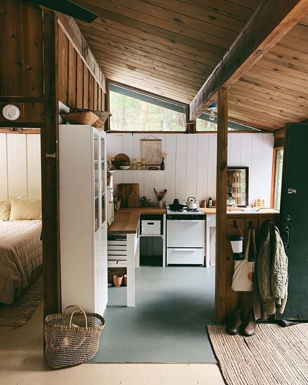
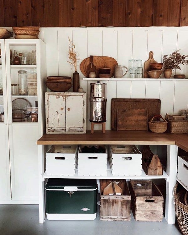
The materials you use should match what you are working with, and where you hope to build. There is nothing wrong with inexpensive materials themselves, and sometimes the cheaper option is the more suitable one. Have a look at this New Hampshire cabin kitchen, for example:

Much of good design is refusing to do what’s bad. Avoiding kitsch or out-of-proportion decor is important. A cabin is a place of simplicity. Wood ceilings and exposed beams can feel honest in a cabin, while high-tech appliances like modern stainless steel with blue-LED displays would feel dishonest. So too would granite countertops in an otherwise rustic setting. What Forestbound has built for cabinetry are simply 2x4 studs, pine boards, and a few wood crates, all painted white. This is inexpensive, and keeps the feel of the space genuine. An identical setup of cabinets and counters in a stately colonial would feel out of place, though they may feel honest if you were building a farmhouse of the same size.
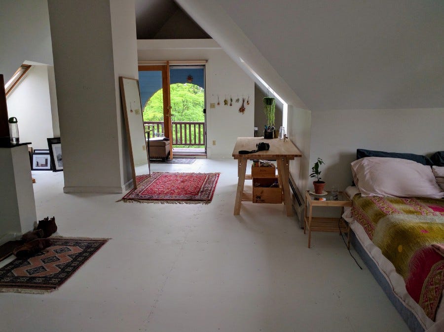
In 2016, we lived in the attic of an old house, which had interesting skylights, an unusual floor plan and a 3rd story porch, but it was renovated long ago with now-disgusting carpet. Simplicity and I ripped up the carpet to reveal a plywood sub-floor. We couldn’t afford anything fancy (and it wasn’t our house), so we felt the most honest way to renovate it would be to simply paint the plywood white, and let it be what it is, a simple, un-fussy attic apartment.
For great examples of honest and dishonest design, read the books by Marianne Cusato (Get Your House Right) and Leon Krier (Drawing for Architecture) that I mentioned earlier in the Research post.
Examples of honest and dishonest materials and renovations are a little harder to come by, though they are always interesting to talk about, but I don’t want to get carried away.
Tile and Countertops
Tile is commonly used in new home construction in mud rooms, kitchens, and bathrooms. It is almost always either large faux-wood plank style or square tiles (large = faster and cheaper to install and grout) that look like this:
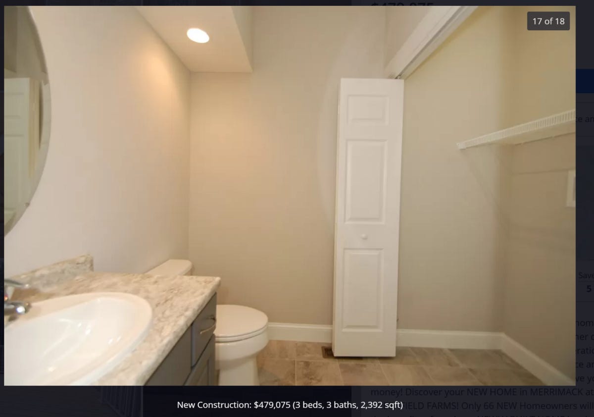
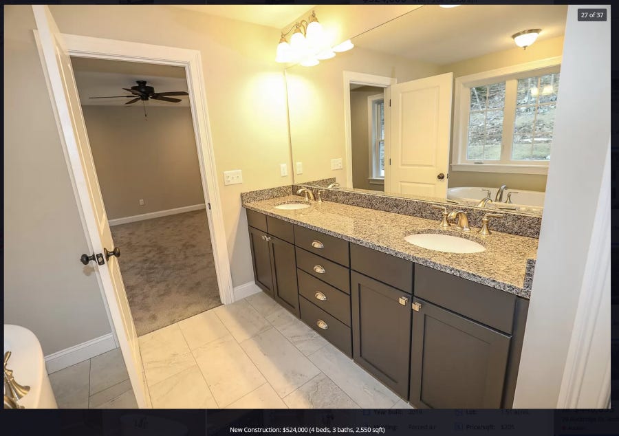
Do these 49 cent per square foot tiles look familiar? Like gray carpet, they are everywhere. Tile quality in new construction rarely goes above $2/square foot. Note the similarities in fixtures, tiles, colors, and carpet of these three half-million dollar homes:

These new homes illustrate some of the problem with modern cleanliness. It’s not just “clean” but a kind of sameness-filled sterility that the builders are getting away with. None of the rooms are inspired. None of the builders are trying their best. You can’t even tell the pictures are from three different houses.
I don’t want to convince you against designing with a clean or minimalist aesthetic if that’s your desire. A spare austerity can be dramatic and beautiful. But you should be wary of the identity-less sterility that permeates modern home construction. These houses are the opposite of having an aesthetic preference, they are trying to have no opinion at all, not even venturing to have a shade of color beyond beige. They contain the opposite of creativity, a kind of generic muteness. In a profession where your role is to create things, it is cowardly.
For tile: I cannot tell you what to design, it’s only easy to tell you what to avoid. But you should look at a lot of images to get an idea of what else is possible, and at what price. Manufacturer sites like Clé Tile can offer a lot of inspiration. (We used them, and we also used much cheaper tile from places like Wayfair too. The difference in quality is noticeable, though.) You should also use Pinterest to get a feel for what’s possible in terms of making even bathrooms into very charming places.

Pinterest comes with its own tendencies toward sameness but it’s a much better start than only looking at the homes that might be available for you to visit.
The essential thing is that you should try to make your spaces matter. Every room in your home is meaningful, and the smaller the space the more you should be comfortable being bold. Even odd opinions are often better than the endless uniformity you find in new homes.

Countertops
I have only two short notes on countertops: First, marble is not popular in the US because any materials that require maintenance are not popular. Like some of the stone options it needs to be sealed (and eventually, re-sealed), and is more susceptible to damage than granite, quartz, or composites. Still, we love it, so we went with mostly marble for ours.
Second, for smaller spaces, you can often save some money by going to countertop fabricators and choosing from their remnants, the unused slabs from their prior jobs, instead of ordering new slabs. Note that this is only possible once you know the sizes for all your countertops, and it also puts you at the mercy of what they have in stock. We used remnants for our three bathrooms, but not the kitchen.
Walls
In older homes, the walls were typically made of horizontal strips of wood called lath that were covered in plaster, which seeps through the gaps enough to hold itself firmly in place. Drywall, sold in 4-foot by 8-foot panels, replaced this because it is much faster and cheaper to install. Drywall has downsides: Being fairly soft, it scrapes and dents more easily, and if the gaps between boards aren’t taped well it can show, and the sound dampening qualities are somewhat worse.
We are quite fond of plaster, so we opted for veneer plaster walls. This setup uses 4 by 8 foot gypsum boards instead of wood lathe, and then involves skimming a few thin coats of plaster on top of it. This is less labor intensive than the old way of doing things while retaining most of the benefit and all of the look. Pricing for this kind of wall apparently varies greatly depending on your location, but its generally slightly more expensive than drywall. Depending on how you finish plaster walls, you can add pigment directly to the plaster or texture the surface, or simply paint it.

Raw, unpainted and un-pigmented plaster has a slightly mottled appearance, with a cream-white to white-rose color, which changes in different light. We like it so much that we’ve kept most of the walls in our house unpainted plaster.
With wall finishes, you have a lot of options. You could argue that builders painting every single room the same contractor off-white color allows the the buyer to paint the rooms the colors they want, or wallpaper as they want, but it seems like most houses rarely change from the builder defaults. I think you should really explore Pinterest and whatever local historical homes you can find to get some ideas of what’s possible beyond Modernist Minimalist Gray. Eventually we’ll paint or wallpaper some of the surfaces, because the same walls everywhere is a little too much uniformity, but we’re in no rush.
Our Choices
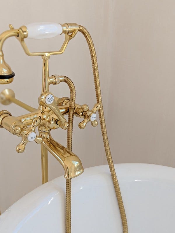
We wanted to avoid chrome as much as possible, so most of our faucets and lights are brass, either polished and coated (common for faucets) or raw (common on lights). These have an aesthetic gravity to them that chrome does not. I’m not exactly sure why they fell out of fashion, but I assume it has to do with the trend towards cleanliness, in that it’s another opinion that people have decided to not have. Working with these other materials is harder: You have to risk them looking gaudy, or silly, or simply out of place, and going the clean chrome route is somewhat a way to dodge this. Some of our fixtures:
To economize on some bathroom fixtures, a few are chrome, and I regret this! They should all be brass. I have since replaced one of them (with a Rohl raw brass faucet that’s quite pretty), and will replace the others in time.
We sourced light fixtures from a number of places, including Ebay and Etsy. For reproduction historical lights, like the ones on the outside of our house, we bought from a small New Hampshire company called Northeast Lantern, which specializes in historical reproduction lights made with raw brass and raw copper.
It turns out you can build your own lights pretty easily, and this is what most of the sellers on Etsy are doing. There are sites like Grand Brass Lamp Parts which offer almost everything you need to make a million different kinds of fixtures. Simi found a shade she really liked for the dining room table lamp, so we made our own fixture out of a brass ceiling base and cord from Grand Brass. Though we eventually replaced this with a more historic chandelier two years later.
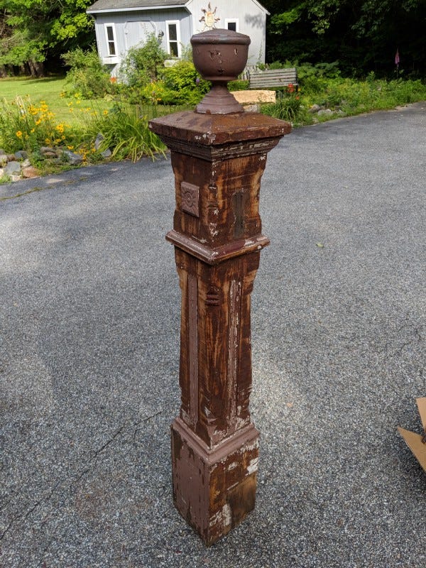
Old houses often had grand and sometimes unique newel posts at the bottom of the stairs. It was actually our builder’s recommendation that we look through architectural salvage stores to find one we like to install, because it would reduce the “sameness” feel of the house hardware. We took his advice, and found an old lavender post that appeared to be walnut underneath the paint (and regrettably gunky brown paint-like stuff under the lavender and white paint). I have no idea why people painted over the magnificent wood, but they did. We cleaned it up and oiled it:
Flooring
I like wood. I like hardwood floors like oak because they are beautiful, accept a lot of stain, and change color with age. I like pine because it dents easily and builds its own character. I like the feel of wood, even the creaks and gaps in old houses. I really don’t like polyurethane floors because the coating takes away from the feel of the material.
I don’t expect everyone to share this opinion. The reason polyurethane floors are so popular is because they are very simple to clean and maintain (provided you don’t damage the coating itself). Prolonged spills cannot water-log them, they cannot be stained by messes, and they can be wiped clean. Older wood floors take maintenance: They need to be re-oiled or waxed periodically to keep their luster and stop dirt and water from harming them. Wood floors without polyurethane coatings wear. They occasionally get warped by moisture. To us, these downsides of older floors add up to the living finish that makes them enchanting. Polyurethane floors feel “clean” in the sterile way that everything in new houses do. Oiled floors feel more like part of nature, the trees that compose the floor are no longer growing but they are still moving through time, gathering stains, scuffs, dark and light patches. They are capable of feeling worn, and this means they are capable of feeling lived in. Sterility is good for the hospital ward, but the home should feel more cozy.
We decided to have a contractor install red oak floors, and we would finish them ourselves in several stages. Since our goal was to have floors with texture and character, we thought that our amateurishness at the task would almost be an advantage.
To start, we used a WOCA color oil product on all the floors. Except for the bathrooms with tile, the whole house has wood floors, so this was most of the square footage.

This looked good, but it dried a little too matte for us. We decided we would lightly sand the floors and oil them again, this time experimenting with Tried and True wood finishes. The benefit of these products is that they are 100% solvent free, have zero VOC’s, and contain no heavy metal drying agents. This allowed us to re-oil each room of the house while we were living in it, without worrying about air quality.
The downside of the these products is that, in containing none of the toxic components found in most floor finishes, they take considerably longer to dry. When using the pine resin finish, which is perhaps the most beautiful one made by Tried and True, it took almost a month to completely cure. So by doing the floors this way we found out why no one does anymore: No one wants to wait! People decided that if noxious vapors are the price of faster construction, so be it.
~ ~ ~
If I can summarize this long post simply: The objects in your house should have an anchoring gravity to them. They should look and feel solid whenever possible. This doesn’t mean they have to be old or look old. They just need to have the weight of real things. Solid wood and metal have weight. Age has its own gravity. There are other ways to give this feeling, if you ponder it for a while.
Hopefully that’s plenty to think about, for now.
s s
This newsletter is called The Map Is Mostly Water, and is about a number of topics.
This house design post is part of a series inside that newsletter, called Everyday Aesthetics.












Simon, this post is terrific — and I think the most terrific part of it is your discussion on honest and dishonest materials. Authenticity in design, I think, trumps all. And you can’t fake authenticity. I think that’s why so many new homes feel off — there is no cohesion. Is the material used appropriate for the place, for the scale, for the intent? When you don’t put that forethought in, and just use whatever is cheap, or available, or looks cool on Pinterest, you end up with discord.
In many cases, I’m not sure it’s necessarily dishonesty. Most buyers are not as discerning as you are, and builders less so. So what feels like a dishonest design choice might often just be one that’s made lacking the knowledge you could do anything else (I think you wrote about this in an earlier post as it relates to the stone surrounding your foundation, plaster walls, etc.).
Posts like this are so important to help people understand why some things feel right or wrong when they otherwise might lack the vernacular to even notice in the first place.
The doorknobs section reminded me of how much i still lust over P.E. Guerin's exquisite creations: https://peguerin.com/productlist.php?section=Door_Hardware&coll=&subcoll=&category=Door_Handles&style=A
(Though from an interior designer friend i learned a single piece is likely more than my not-inconsiderable manhattan rent! One day...)